
Your office footprint isn’t the primary constraint on your business; it’s the visual boundaries that are stifling your team’s output. It’s a common frustration for UK managers who see staff morale dip as desks feel closer together and cluttered walkways make the entire operation look unprofessional. You might assume that moving to a larger building is the only way forward, but learning how to make a small office look bigger is actually a technical challenge solved through precise design rather than physical expansion.
We understand that a cramped environment directly impacts focus and client perception. This guide provides a blueprint to transform restricted workspaces into expansive, productive environments using direct-to-wall UV printing and strategic spatial planning. We will explore how bespoke murals and technical lighting solutions create perceived depth whilst eliminating the maintenance hassles of traditional decor. By the end of this article, you’ll have the professional strategies needed to achieve a spacious, high-resolution finish that lasts for years without peeling or fading.
Key Takeaways
- Master the science of spatial perception to eliminate visual noise and manipulate how the brain interprets physical boundaries.
- Utilise Light Reflectance Value (LRV) and monochromatic colour palettes to blur the edges of a room and maximise light distribution.
- Discover how to make a small office look bigger by prioritising technical wall treatments over bulky storage units that obstruct walkways.
- Implement bespoke murals using linear perspective and Trompe-l’œil techniques to create the illusion of three-dimensional depth in windowless spaces.
- Leverage direct-to-wall UV printing for a seamless, industrial-grade finish that eliminates the peeling and bubbling risks of traditional wallpaper.
The Science of Spatial Perception in Small Offices
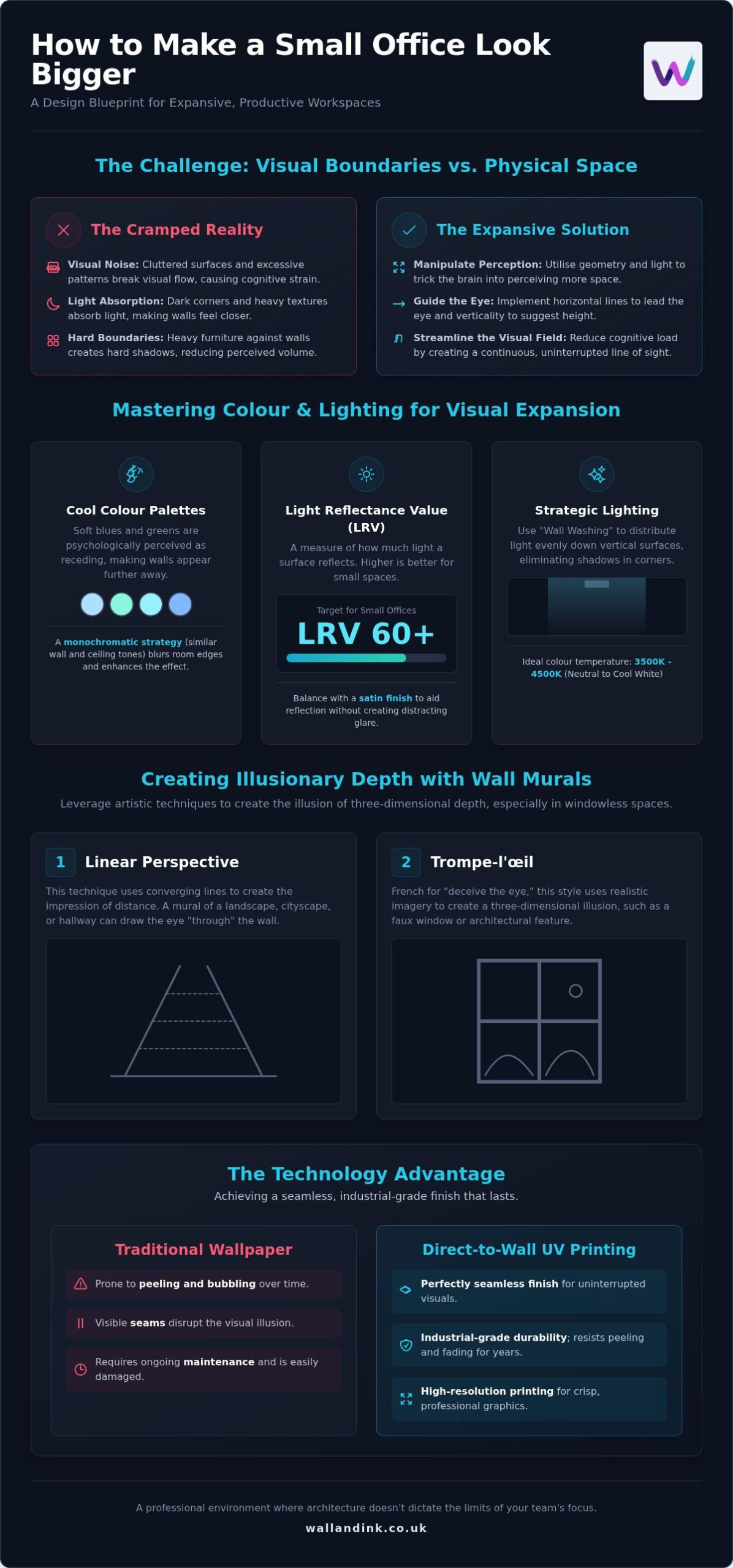
Spatial perception is the result of complex neurological processing where the brain interprets light, shadows, and contrast to define the limits of a room. It’s not merely about the square footage; it’s about how light reaches the retina. When considering how to make a small office look bigger, you must first address these cognitive cues. Traditional office layouts often fail because they place heavy objects against walls, creating hard shadows and cutting the room into smaller, digestible chunks. This reduces the perceived volume, making the environment feel restrictive and uninspiring for the team.
Visual noise is another technical barrier to a spacious feel. Cluttered surfaces and excessive patterns break up the visual flow, forcing the eye to stop at multiple points rather than gliding across the room. By utilising horizontal lines to lead the eye and verticality to suggest height, you can trick the brain into perceiving more distance than physically exists. This is a deliberate application of geometry to override the limitations of a compact floor plan.
Visual Boundaries and the Cramped Office
Dark corners and heavy, textured surfaces are the primary culprits in a restricted workspace. These elements absorb light rather than reflecting it, effectively drawing the walls inward and making the space feel oppressive. This phenomenon creates a closed-in effect that can significantly hinder cognitive performance and staff morale. By understanding the fundamentals of interior design, we can identify dead zones where lack of light or excessive visual noise stops the eye from moving freely. Identifying these areas is the first step in reclaiming the room’s visual potential.
Defining the ‘Open’ Aesthetic
There is a critical distinction between physical space and visual volume. You cannot always move walls, but you can manipulate the visual volume by adjusting how surfaces interact with light. True minimalism in a professional setting isn’t about removing essential equipment; it’s about streamlining the visual field to reduce cognitive load. To understand how to make a small office look bigger, designers focus on maintaining a continuous line of sight. This involves several technical adjustments:
- Maximising floor visibility: Seeing the floor-to-wall transition suggests a larger footprint.
- Utilising vertical lines: Drawing the eye upward increases perceived ceiling height.
- Eliminating micro-shadows: Removing heavy textures that break up light distribution.
Establishing this baseline allows for a design that feels expansive whilst remaining functional for high-stakes business operations. It’s about creating a professional environment where the architecture doesn’t dictate the limits of your team’s focus.
Mastering Colour and Lighting for Visual Expansion
Selecting a colour palette is a technical decision rather than an aesthetic whim. To understand how to make a small office look bigger, you must look at how different wavelengths of light interact with your vertical surfaces. Cool colours like soft blues and greens are psychologically perceived as receding. This means the brain interprets these walls as being further away than they actually are. When combined with a monochromatic strategy, where the ceiling and walls share a similar tone, the physical boundaries of the room become less distinct. This lack of contrast prevents the eye from stopping at corners, effectively extending the visual volume of the workspace.
The Technicality of LRV in Office Design
Professional designers utilise Light Reflectance Value (LRV) to quantify how much light a surface will return to the room. On a scale of 0 to 100, a higher number indicates greater reflection. For a compact office, aim for an LRV of 60 or above. This ensures that both natural and artificial light are distributed efficiently across the floor plan. However, a high LRV must be balanced with the correct finish. A matt finish provides excellent colour depth but can absorb light, whilst a satin finish offers a slight sheen that aids reflection without the distracting glare of a high-gloss surface. This technical balance is essential for maintaining a professional environment that supports screen-based work.
Artificial Lighting and Wall Interaction
Artificial lighting must be strategically positioned to eliminate the cave effect often found in small units. Wall washing is a technique where luminaires are placed to provide a uniform distribution of light across a vertical surface. This removes shadows in corners that traditionally draw the walls inward. The colour temperature, measured in Kelvins, should ideally sit between 3500K and 4000K. This range mimics natural daylight, which is crucial for maintaining focus and accurate colour perception. When you opt for bespoke wall art applied via UV printing, the ink’s durability ensures the colours don’t shift under these specific lighting conditions. The result is a crisp, expansive environment that remains consistent throughout the working day.
Strategic Furniture Selection vs. Visual Wall Solutions
The debate between floor space and wall space is a fundamental consideration for any UK business operating in a compact unit. Traditional advice often suggests adding more storage to clear the clutter, but bulky cabinets often turn a functional office into a cramped corridor. When prioritising how to make a small office look bigger, the focus must shift from physical additions to visual optimisations. Reclaiming floor space from heavy furniture is the most direct way to increase the perceived volume of a room. Every square centimetre of floor that remains visible contributes to a sense of openness and professional clarity.
Choosing Multi-Functional Furniture
In a restricted floor plan, the profile of your furniture is just as important as its utility. Professional designers prioritise slimline pieces with exposed legs rather than solid bases. Seeing the floor continue underneath a desk or chair provides a continuous visual plane that tricks the brain into perceiving more room. Modular systems are also vital. These allow for an organised workspace that can be reconfigured as requirements change, preventing the permanent blockage of walkways. Desk placement should always follow the flow of natural light; shadows cast by poorly positioned furniture can inadvertently shrink the perceived boundaries of the workspace.
The Furniture-Free Wall Strategy
Physical decor often adds unnecessary depth that a small office cannot afford. Heavy shelving, protruding frames, and traditional noticeboards can shrink a room by several centimetres on every side. By transitioning to a furniture-free wall strategy, you can utilise vertical space for branding and aesthetics without sacrificing a single millimetre of floor area. Direct-to-wall UV printing allows for high-resolution graphics to be applied directly to the plaster or brick substrate. This modern approach eliminates the need for bulky vinyl decals or frames that collect dust and eventually peel. A curated wall mural creates a powerful focal point that draws the eye, providing the visual expansion required to make the environment feel more prestigious and less restricted. This shift from cluttered shelving to integrated graphics is a hallmark of modern, efficient office design.
Using Bespoke Murals to Create Illusionary Depth
Whilst furniture and lighting provide the foundation for a better workspace, bespoke murals offer a technical solution to the physical limitations of four walls. The concept of Trompe-l’œil, which translates to “deceive the eye”, uses realistic imagery to create the illusion of three-dimensional space. Unlike mirrors, which can cause distracting reflections and require constant cleaning, a high-resolution mural provides a stable, professional backdrop. When researching how to make a small office look bigger, many decision-makers overlook the impact of linear perspective. By using vanishing points in a design, you can effectively extend a room by several metres, tricking the brain into seeing a corridor or landscape where there is only a solid surface.
Bespoke designs outperform generic wallpaper because they are engineered for the specific dimensions of your room. Traditional wallpaper often features repeating patterns that actually highlight the boundaries of a small space. In contrast, a custom-designed mural allows for precise control over scale and depth, ensuring the visual expansion feels intentional rather than accidental. This tailored approach is essential for maintaining a high-stakes professional aesthetic whilst solving spatial constraints.
The Power of Perspective in Office Murals
A well-positioned horizon line is a powerful tool for spatial correction. Placing the horizon at eye level creates a sense of vastness that can lower perceived stress levels amongst staff. Architectural motifs, such as printed windows or structural columns, can add architectural interest to windowless rooms. This technical application of art ensures the scale of the mural matches the office proportions perfectly, preventing the imagery from overwhelming the space or feeling out of place.
Designing for Your Specific Layout
Identifying the primary feature wall is essential for maximum impact. This is typically the wall furthest from the entrance, as it sets the initial visual depth of the room upon entry. To further break the box feel, murals can be wrapped around corners. This technique softens hard angles and makes the transition between walls feel seamless. Collaborating with specialists ensures you can visualise the mural before the printing process begins. If you are ready to transform your workspace with precision, you can explore our range of commercial wall murals to find a technical solution tailored to your specific office layout.
Implementing Direct-to-Wall Printing for a Seamless Finish
Direct-to-wall UV printing is the definitive solution for modern workspace optimisation. Traditional methods like wallpaper and vinyl decals introduce physical layers that actually draw attention to the wall’s surface, reinforcing the room’s boundaries. Direct-to-wall technology eliminates these layers by applying high-resolution ink directly to the existing substrate. This creates a seamless finish where the artwork appears integrated into the architecture itself. When considering how to make a small office look bigger, this lack of a physical border is essential; it allows the eye to perceive the wall as an expansive window or an endless horizon rather than a flat, obstructed surface. By removing the visual interruption of seams and edges, you effectively push the visual boundaries of the room outward.
UV Printing vs. Traditional Wallpaper and Vinyl
Traditional vinyl decals often suffer from thermal expansion and contraction, leading to shrinking, peeling, and unsightly bubbling over time. In high-traffic UK offices, wallpaper is equally prone to scuffing and edge-lift at the seams. Direct-to-wall UV printing bypasses these failures entirely. The ink is cured instantly by ultraviolet light, creating a permanent bond with surfaces ranging from smooth plaster to textured brick and industrial wood. Whether you are working with an older brick-walled unit or a modern plasterboard partition, the technology adapts to the substrate without compromising resolution. This technical superiority ensures the mural remains as crisp as the day it was printed. It is a durable, industrial-grade solution that requires zero maintenance and maintains its visual depth for years, providing a professional aesthetic that traditional alternatives cannot match.
The Installation Journey with Wall & Ink
Our process is designed for pragmatic decision-makers who value efficiency and high-quality results. It begins with a digital visualisation where we map the bespoke design to your specific office proportions, ensuring the perspective is technically accurate. On-site, our specialists utilise precision UV printers to execute the design with millimetre accuracy. The process is fast, clean, and produces zero waste, avoiding the mess of adhesive paste or the off-gassing of traditional solvents. This methodical approach ensures your workspace transformation is completed with minimal disruption to your daily operations. If you are ready to expand your space, you can Book a Bespoke Design Consultation with Wall & Ink to discuss how our technical printing solutions can redefine your professional environment.
Redefining Your Professional Footprint Through Technical Design
Understanding how to make a small office look bigger requires a shift from physical expansion to visual optimisation. By mastering the science of spatial perception and utilising technical tools like high Light Reflectance Value (LRV) finishes, you can effectively override the physical constraints of a compact floor plan. Replacing bulky furniture with integrated wall solutions and linear perspective murals creates a sense of depth that a standard office environment lacks.
Wall & Ink provides the industrial precision needed to execute these strategies across the UK. Our professional UV printing technology ensures a high-resolution, durable finish applied directly to your substrate without the failures of traditional wallpaper. We provide bespoke design consultations and digital mock-ups to ensure your chosen imagery aligns perfectly with your office proportions. This methodical approach eliminates the mess of legacy methods whilst delivering a modern, expansive aesthetic that supports both staff morale and professional perception.
Transform your office with a bespoke wall mural from Wall & Ink and reclaim your workspace today.
Frequently Asked Questions
Does painting a small office white actually make it look bigger?
White is not the only solution for how to make a small office look bigger. Whilst white has a high Light Reflectance Value (LRV), it can sometimes make a space feel clinical or highlight shadows in dark corners. Professional designers often prefer soft, cool tones like pale blues or greys. These colours recede visually, pushing boundaries outward more effectively than a flat white whilst providing a more sophisticated, professional atmosphere for your team.
How do I choose the right wall for a perspective mural?
The ideal location is typically the feature wall furthest from the primary entrance. This choice creates an immediate sense of depth the moment a client or employee enters the room. You should avoid walls heavily obstructed by tall storage units or equipment. A clear, expansive surface allows the linear perspective of the mural to function correctly, effectively extending the visual volume of the workspace without requiring physical alterations.
Is wall printing better than wallpaper for a busy commercial office?
Direct-to-wall UV printing is superior for high-traffic environments. Traditional wallpaper is prone to peeling at the seams and bubbling in varied temperatures. Our UV ink technology bonds directly to the substrate, providing industrial-grade durability that resists scuffs and fading. This set and forget solution eliminates the maintenance hassles associated with legacy decor methods, ensuring your office maintains a crisp, professional appearance for years without the risk of edge-lift.
Can I use dark colours in a small office without it feeling like a cave?
Dark colours can be used effectively if you balance them with high-quality artificial lighting and reflective finishes. Using a dark tone on a single wall can actually create a sense of infinite depth, especially when paired with a perspective-driven mural. It’s about contrast rather than brightness. By technical application of wall washing light techniques, you can ensure dark surfaces add character and prestige without compromising the perceived size of the workspace.
What kind of images are best for creating the illusion of depth?
Images featuring a strong vanishing point are most effective. Landscapes with distant horizons, architectural corridors, or abstract geometric lines that lead the eye inward are excellent choices. These motifs trick the brain into perceiving three-dimensional space on a flat surface. When considering how to make a small office look bigger, avoid busy, repeating patterns. Instead, opt for bespoke designs that offer a clear visual path, effectively opening the wall.
How long does direct-to-wall UV printing take to install?
The installation process is significantly faster than traditional decorating methods. Most commercial murals are completed within a single working day. Because the UV ink cures instantly under ultraviolet light, there is no drying time or lingering chemical odour. This allows for immediate use of the office space after the technician finishes. It is a clean, zero-waste process that avoids the traditional inconveniences of adhesive paste or drying periods.
Will a wall mural be too distracting for my employees?
A well-designed mural actually reduces cognitive load by providing a restful focal point. Rather than a cluttered wall of shelves or noticeboards, a curated mural organises the visual field. Environmental psychology suggests that views of nature or structured architectural lines can lower stress levels and improve focus. By replacing visual noise with a professional, expansive image, you create a calmer environment that supports sustained concentration and team productivity.
Can you print on textured walls like brick or rough plaster?
Our advanced UV printing technology is designed to adapt to various substrates, including exposed brick, rough plaster, and industrial wood. The printer maintains high-resolution detail by adjusting to the surface irregularities. This eliminates the need for expensive skimming or wall preparation required for vinyl decals or wallpaper. The result is a durable, integrated finish that celebrates the building’s character whilst transforming the wall into a high-impact visual asset.