
A visually stimulating workplace is not just a finishing touch: its design can affect how people feel and work. Improving workplace environment aesthetics can support productivity, with University of Exeter research finding that personalised workspaces boosted productivity by 32%, while employees in offices with plants and artwork were 17% more productive than those in functional, bare spaces. The figures point to a practical opportunity, not a guarantee that a redesign will produce the same result everywhere.
When improving workplace environment aesthetics, consider comfort, appearance and cost together. A workplace should feel considered and support concentration, while its finishes and features must suit the budget, daily use and maintenance needs.
This article explains how aesthetics can influence wellbeing, mood and creativity, and what to weigh when planning changes. It looks at colour, natural elements and visual identity alongside durability, upkeep and sustainability, so you can make design decisions that are both purposeful and practical.
Key Takeaways
- Consider how natural light, artwork and personal touches may shape staff comfort and focus, rather than treating appearance as a purely decorative choice.
- Weigh the full upkeep of each design decision: durable finishes and sustainable features can influence ongoing maintenance and operating costs.
- Use colour with purpose. Blues and greens can support a calm, focused atmosphere, while the right choice depends on the mood and tasks of each space.
- Make room for visual interest without losing function. Brand imagery, privacy and quiet areas can all contribute to a more supportive workplace.
- Assess changes against clear workplace priorities, including staff feedback, concentration, collaboration and the practical demands of maintaining the space.
Workplace aesthetics, employee satisfaction and wellbeing
A workplace’s appearance does more than shape first impressions. Natural elements, artwork and a clear visual identity can influence how employees experience their surroundings. A bare room with harsh lighting, for example, feels different from a space with daylight, considered colour and welcoming shared areas. These choices can support comfort and appeal, but should complement the work rather than compete with it.
Nature is one practical consideration. A review of fifty studies, cited by the National Institutes of Health, found that environments without nature negatively affect mental health. Employers can consider natural light, plants or nature-inspired artwork when planning a workspace. The right approach depends on the room: a reception may suit a prominent mural, while a focused work zone may benefit from simpler visual detail.
Décor can also affect employees’ satisfaction with their workplace. In Momentum’s original research, over 65% of surveyed credit union employees were unsatisfied with their workplace’s general décor; the survey included over 1,200 employees. That finding points to a useful discussion, not a universal design formula. Ask staff which features feel dated, distracting or disconnected from the organisation’s identity, then group the feedback by shared themes.
Personalisation can help employees feel more invested in their environment. Research from the University of Exeter found that personalised workspaces boosted productivity by 32%. In a separate finding, University of Exeter researchers found employees in offices decorated with plants and artwork were 17% more productive than employees in functional but bare spaces. Treat these figures as evidence for thoughtful design, not a guaranteed result for every office.
Involve employees before choosing artwork or workstation details. Ask teams which images, colours or local references feel relevant, then review a shortlist against the workplace’s purpose. A collaborative area might use shared visual themes, while individual desks allow modest personal touches. Discuss furniture needs too, including ergonomic requirements, so appearance does not lead to unsuitable workstation choices.
What are the risks of prioritising aesthetics over ergonomics and safety? Attractive furniture can still cause discomfort if it does not suit users’ tasks or needs. Obstructed routes, unstable displays and distracting artwork can also undermine safe, practical work. Assess access, visibility and workstation function alongside visual appeal.
Budget, maintenance and sustainability challenges
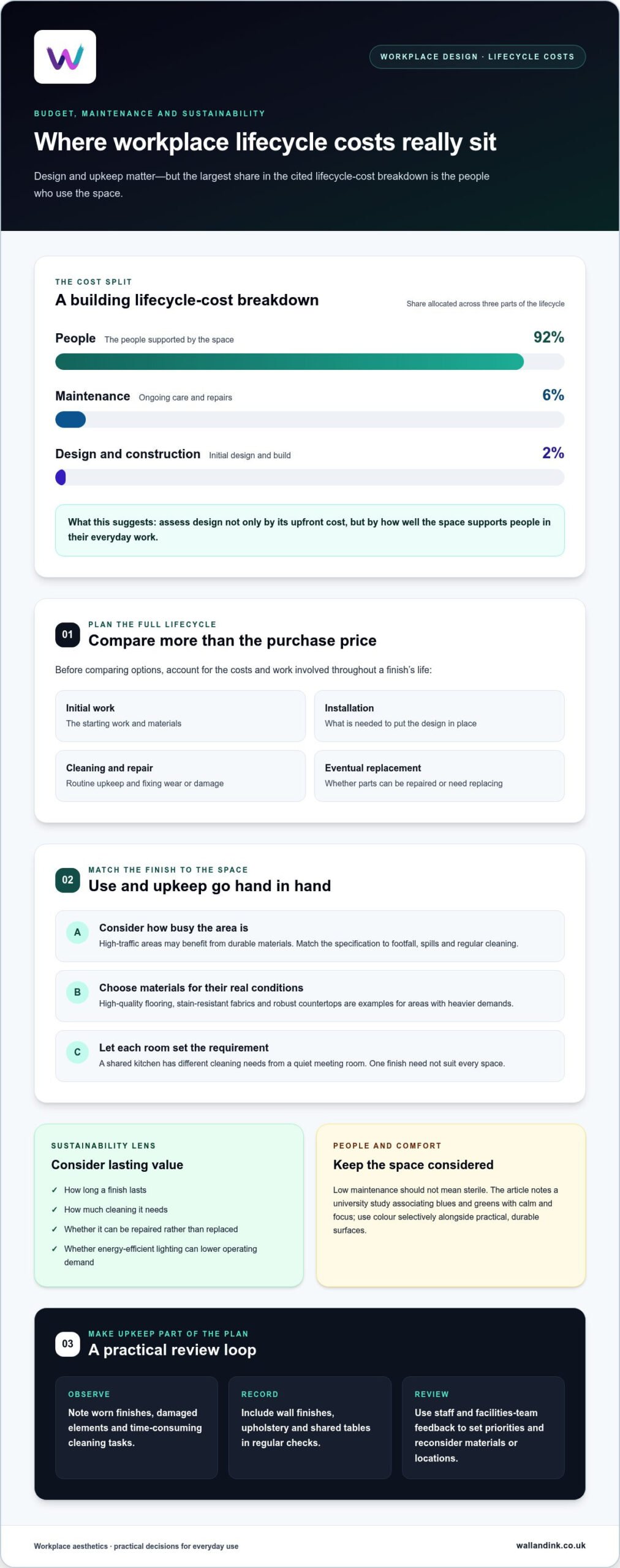
Plan workplace improvements around their full lifecycle, not just the initial purchase. A building lifecycle-cost breakdown allocates 2% to design and construction, 6% to maintenance, and 92% to people. This frames office design as an investment in how spaces support daily work, as well as a decision about materials and upkeep. For example, a feature that looks effective in a reception area may be less useful if it obstructs movement or needs frequent repair.
Divide the budget into practical categories before comparing design options. Include initial work, installation, cleaning, repair and eventual replacement. A painted feature wall, for instance, may need different upkeep from a high-traffic surface that is often touched or cleaned. This comparison helps teams decide where a visual change will deliver lasting value and where a simpler finish will do the job.
Durable materials can reduce long-term maintenance costs in busy areas. High-quality flooring, stain-resistant fabrics and robust countertops are useful examples. Suitability depends on how each space is used: a shared kitchen has different cleaning needs from a quiet meeting room. Match specifications to actual conditions, including footfall, spills and regular cleaning, rather than choosing finishes on appearance alone.
Maintenance also affects how consistently a workplace looks and feels. Set a clear routine for inspecting surfaces, refreshing worn finishes and replacing damaged elements. For example, a facilities team can include wall finishes, upholstery and shared tables in its regular checks. A short, recorded list makes it easier to spot recurring damage and consider whether the material or its location needs changing.
Sustainable design can reduce environmental impact and operating costs. Consider how long a finish lasts, how much cleaning it needs and whether it can be repaired rather than replaced. Energy-efficient lighting can help lower operating demand, while natural light may reduce reliance on artificial lighting during the day. The practical benefit depends on the building’s layout and how each room is used.
Keep the mental experience in view, too. A low-maintenance space should still feel considered, not sterile. A university study on workplace colour associated blues and greens with calm and focus. Use these colours selectively, balancing them with durable surfaces in high-use areas. A calm meeting room and a hard-wearing corridor can serve different needs within the same office.
Encourage staff and facilities teams to weigh upkeep alongside visual appeal. Ask which areas look worn, which cleaning tasks take the most effort and which changes would improve daily use. Their examples can help set priorities, protect the budget and make sustainability part of routine decisions, rather than a separate design exercise.
Colour psychology and workplace mood
Colour gives each workspace its own visual character. A focused meeting room, busy reception and shared project area do not need identical palettes. Start by identifying each room’s main purpose, then choose colours that support its intended mood. This connects decorative choices to how employees use the space, rather than imposing one scheme across the office.
The University of British Columbia study cited on workplace colour found that blues and greens can create a calm, focused environment. Apply this finding selectively: blue could feature on a meeting-room wall, while green accents might suit a quiet work area. Treat these shades as design choices, not a guarantee of better productivity or a substitute for practical workplace planning.
Build a palette around the room’s function and existing finishes. A collaborative space, for example, could use a stronger accent colour on one wall, balanced by neutral desks and flooring. In a room used for detailed work, a restrained palette can reduce visual competition from equipment, screens and documents. Aim for a clear visual hierarchy, not maximum colour.
Review the physical conditions before finalising paint or artwork colours. Daylight, artificial lighting and nearby materials can change how a shade looks across a room. Muted green beside timber, for instance, may look different from the same colour beside grey flooring. Test samples on the actual wall, then view them from workstations and shared areas before deciding.
Use colour to distinguish zones without creating confusing visual boundaries. A coloured wall behind a meeting table can signal a collaboration area, while consistent tones along a corridor can create a sense of continuity. Keep routes, signs and important displays easy to see. Strong contrast can make key information stand out, but busy patterns behind instructions may make them harder to read.
Plants and other natural elements can complement a colour plan. Green foliage against a neutral wall, for instance, adds contrast without introducing another dominant shade. Match plant placement to the room’s use and available light. In a shared workspace, keep displays clear of screens, notices and surfaces employees need for daily tasks.
Review colour choices in a few clear steps: define the room’s purpose, shortlist suitable shades, test them on-site, then ask employees for feedback. A small sample area in a break room or project space lets staff assess the effect before the palette is used more widely. Record comments on comfort, visual clarity and intended use, then adjust the scheme.
Creativity and innovation in visually stimulating offices
Visual stimulation can give employees useful prompts for thinking, but it needs a purpose. A project room might display prototypes, sketches and a large shared planning surface. These elements make current work visible and give colleagues something specific to discuss. In a quieter area, a single illustrated feature wall can add character without competing with detailed tasks or screens.
Workplace design research has considered organisational aesthetics across several decades. Researchers reviewed articles published from 1980 to 2021, selecting 177 articles from management journals and book chapters. That breadth reflects a useful distinction: aesthetics are not limited to decoration. Layout, lighting, furniture and visible symbols all shape how a workplace communicates its purpose and supports its routines.
Start with the work employees need to do together. Arrange project tables, for example, so colleagues can share materials and see a central display, while keeping routes clear. An efficient layout can streamline workflow and make good use of space. If a team moves frequently between discussion and focused work, define separate zones with furniture and visual cues rather than filling every available surface.
Glass walls can make a space feel more open while maintaining privacy where needed. A glazed meeting-room partition can preserve sightlines from the surrounding office, with screening for confidential conversations. This can help a compact floor plan feel connected without making every activity visible. Decide what should be seen and what needs discretion before planning the partition layout.
Lighting also affects how people use visual information. A design studio reviewing physical samples needs clear, even illumination; a presentation space may need adjustable lighting for screens. Consider tasks when choosing fittings and positioning workstations. A bright feature wall cannot compensate for poorly lit work surfaces, so coordinate lighting with furniture, screen placement and the room’s daily use.
Brand colours and imagery can create a consistent identity across different spaces. A reception might use a prominent brand graphic, while meeting rooms feature a smaller, recurring motif. This creates a recognisable thread for visitors and employees without repeating the same design everywhere. Choose images related to the organisation’s work, people or place, rather than filling empty walls for the sake of it.
Technology can equip an office for modern needs, but should support the visual plan. Position shared screens where people can see them without blocking walkways, and provide practical surfaces for laptops or prototypes. Keep cables and equipment organised. When visual features, technology and furniture work together, the space can encourage exchange while remaining practical for everyday tasks.
How should businesses assess the impact of workplace design changes?
Assess each design change against the problem it was meant to solve. If a project area is redesigned to encourage collaboration, observe whether colleagues use it for discussion and shared work. If a quiet zone is intended to support concentration, note whether staff can work there without interruption. For businesses improving workplace environment aesthetics, clear objectives help distinguish useful changes from purely cosmetic ones.
Record a baseline before changing the space. Note how employees use meeting rooms, where bottlenecks occur and which areas staff avoid. Gather feedback on comfort, appearance and practical obstacles. A facilities team can also record recurring maintenance issues, such as scuffed walls or cluttered shared tables. These observations provide a useful comparison after the redesign.
Choose measures that match the project’s purpose. Improving workplace environment aesthetics does not require relying on a single productivity score. Track workplace behaviours and staff feedback, such as:
- Whether employees use the intended collaboration or focus areas.
- How easily teams move between workstations and shared rooms.
- Whether staff describe the space as comfortable and suitable for tasks.
- How often facilities teams need to clean, repair or replace finishes.
- Whether visitors can identify reception, meeting areas and key routes.
Compare the same observations after the change. If a new layout is intended to reduce congestion, review the same routes under similar working conditions. If artwork has been added to a shared space, ask whether it feels welcoming or creates visual distraction. Consistent questions help teams interpret feedback instead of relying on a single reaction or informal impression.
Separate design effects from other changes. A team may use a meeting area more often because its workload has increased, not because new furniture was installed. Record relevant changes in room use, staffing or work routines alongside feedback. This context makes your assessment of improving workplace environment aesthetics more useful and grounded.
Use the findings to refine the space. If employees avoid a collaboration zone because furniture obstructs movement, adjust the layout before adding visual features. If a wall finish needs frequent attention, include its upkeep in the next design review. For a workplace visual feature, explore options for workplace wall graphics that can contribute to the space’s identity and intended use.
Wall & Ink: Direct-to-Wall Printing
Wall & Ink creates custom workplace graphics with Direct-to-Wall Printing, applying artwork directly to the wall. It is a practical way to add a distinctive visual feature without changing the layout or furniture. Commercial Wall Murals can bring brand imagery to reception areas, meeting rooms or shared spaces, with designs tailored to the organisation.
For projects with a clear purpose, such as strengthening visual identity or adding interest to a plain office wall, bespoke design and digital visualisations help shape the concept before professional on-site installation. Wall & Ink also creates School and Educational Murals for learning environments.
Visit Wall & Ink to discuss a workplace wall design suited to your space.
Turn your workplace vision into a considered design
A considered approach to improving workplace environment aesthetics starts with a clear purpose for each space. Decide what a feature should communicate, who will use the room and how it should feel during a typical working day. This brief gives artwork a defined role, rather than making it an isolated decorative choice.
Wall & Ink’s Direct-to-Wall Printing and Commercial Wall Murals can translate a workplace identity into a visual feature. Residential Wall Art is also available for home interiors. Start by identifying the wall, its audience and the visual direction that suits the space. A focused brief makes design discussions more useful and connects the result to how the environment is used.
Whether you’re planning a single feature or shaping a broader visual direction, start with the purpose you want the space to serve. Contact Wall & Ink to discuss your workspace and take the next step towards a workplace design that feels purposeful and distinctive.
Wall & Ink for Workplace Aesthetics
Wall & Ink offers Direct-to-Wall Printing and Commercial Wall Murals for workplaces that want wall design to contribute to the environment. These options can carry an aesthetics plan onto interior walls.
For other settings, Wall & Ink also offers Residential Wall Art, School and Educational Murals, Retail and Hospitality Graphics, and Exterior Wall Printing.
Frequently Asked Questions
Do the Aesthetics of Your Workplace Affect Productivity?
Yes, workplace aesthetics can influence the conditions in which employees work, including comfort, concentration and interaction. A cluttered layout, distracting visual feature or poorly organised shared area may interrupt everyday tasks. A team reviewing detailed documents, for example, may need a calmer setting than one giving presentations. Assess productivity alongside how people use the space, rather than judging design by appearance alone.
What is organisational aesthetics?
Organisational aesthetics describes how a workplace’s visible and sensory qualities communicate what an organisation values and how it operates. It includes the layout, materials, lighting, artwork and objects that employees and visitors encounter. A design studio displaying current prototypes, for example, communicates its creative work differently from a formal reception with restrained finishes. These choices shape the experience of a place, not just its decoration.
What will I read about in this article?
This guide explains how to decide what a workplace needs before making design changes. It considers how appearance relates to staff experience, how to weigh upkeep and sustainability, and how colour and visual features can support different activities. It also explains how to review changes afterwards, identify what works and what needs adjustment, and decide which design choices deserve further attention.
What workplace design features improve employee wellbeing and productivity?
Features that support employees’ tasks can make a workplace more comfortable and usable. Consider adjustable task lighting for detailed work, accessible storage near the relevant workstation and clear routes between shared areas. A team that takes frequent calls may benefit from a designated quieter space. Ask employees to identify friction points in their day, then match design decisions to those needs.
What are the best office colour schemes and materials for workplace aesthetics?
The right scheme suits the room’s purpose, existing finishes and maintenance needs. A neutral base can keep a small office visually cohesive, while a carefully chosen accent can distinguish a meeting area. Compare paint and material samples with flooring, furniture and lighting before choosing. In busy areas, consider finishes that withstand regular cleaning and wear so the scheme remains practical over time.
How much does an office makeover cost in the UK?
Office makeover costs depend on the project’s scope, the work involved and the materials selected. The price depends on the individual project and is provided after a quote request; factors include wall area, surface condition, design complexity and installation requirements. A refresh focused on one wall differs from a wider refit involving furniture and building work. Define the intended changes first to make budget comparisons meaningful.
What are low-cost ways to improve workplace aesthetics?
Start with changes that use existing resources. Reorganise furniture to improve circulation, remove outdated notices and tidy visible cables around shared equipment. A facilities team can repair small areas of scuffed paint or rearrange existing artwork. Clearing a meeting-room table between sessions, for example, can make the space feel more orderly without adding furniture or changing the layout.
How can employers involve staff in workplace design decisions?
Give employees a clear way to share feedback before decisions are final. Ask teams to identify one practical problem and one visual improvement for their area, then group responses by common themes. A short workshop can compare artwork concepts with the room’s use and organisational identity. Explain which suggestions will be acted on and why, so staff can see how their input shaped the finished workplace.