
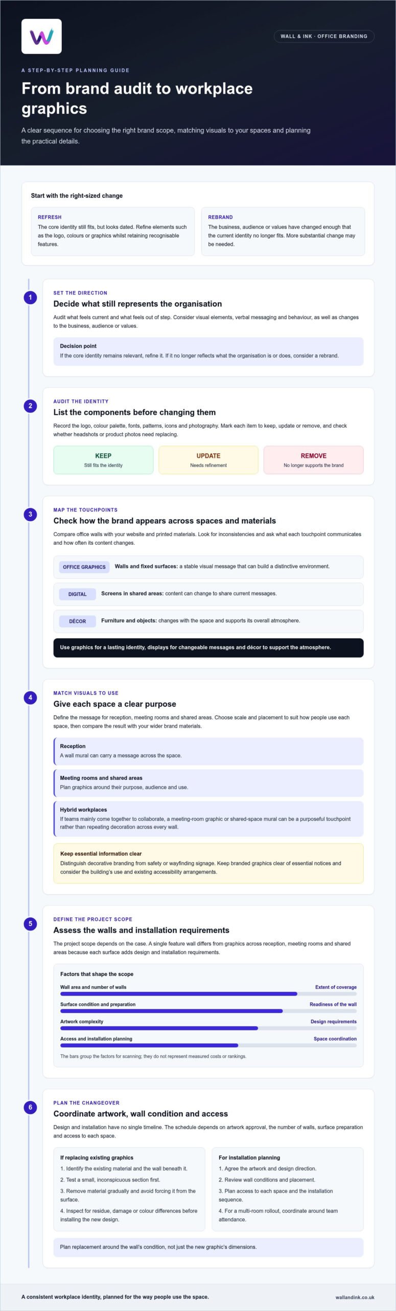
A full rebrand isn’t automatically the stronger choice. Choose a refresh if your office branding feels dated but still reflects the business; choose a rebrand if the identity no longer fits what the organisation is or does. When updating office branding graphics, the goal is to make the workplace feel consistent with the brand without changing more than the business needs.
It’s easy to focus on a new logo or colour palette, but those choices also shape how your brand appears across meeting rooms, reception areas and shared spaces. In a hybrid workplace, office graphics can express your culture and identity when colleagues come together in person.
This guide explains how to choose between a refresh and a rebrand, what to review across your visual identity and brand touchpoints, and how to plan graphics for a workplace used by on-site and hybrid teams. It also offers a practical way to define the right scope before updating your office.
Key Takeaways
- Choose a refresh when your identity still fits but needs refinement; consider a rebrand when it no longer reflects the organisation.
- Map the logo, colours, fonts and supporting graphics across workplace and customer touchpoints to spot inconsistencies.
- Plan office visuals around how people use the workplace, including collaboration areas and spaces that support hybrid teams.
- Set the scope by considering wall dimensions, surface condition, artwork detail and installation requirements before choosing a graphics solution.
Brand components and touchpoints
A workplace identity extends beyond its logo. Colour, fonts, photography and supporting graphics all shape recognition. Map these elements across office walls, websites and printed materials before choosing a direction.
Office branding graphics
Office branding graphics turn a physical space into a brand touchpoint. A wall mural can carry a message across reception, while a digital display can change its content for a campaign or announcement. Furniture and objects contribute to the atmosphere but may not communicate the brand as directly. Graphics work best when their purpose and placement are clear.
Compare the touchpoints by asking what each communicates and how often it changes. Coca-Cola has kept the same word mark since 1905 while changing its appearance and background. That example shows how supporting visuals can evolve around a recognisable core. The Ministry of Justice added a bright and a dark shade for each colour in its palette, allowing more design variation and accessibility.
Planning and designing graphics
Start by auditing your existing identity. List the logo, colour palette, fonts, patterns, icons and photography, then mark each item to keep, update or remove. Check whether headshots or product photos need replacing. The Department for Education added six brighter colours and five darker colours to its existing dark blue palette, showing how a defined colour system can allow more variation.
Next, match graphics to specific spaces and audiences. Define the message for reception, meeting rooms and shared areas, then choose scale and placement to suit how people use each space. Compare the result with your website, social media and printed materials to keep the visual style consistent.
| Option | Placement | Content flexibility | Brand role |
|---|---|---|---|
| Office graphics | Walls and fixed surfaces | Stable visual message | Builds a distinctive environment |
| Digital displays | Screens in shared areas | Content can change | Shares current messages |
| Other décor | Furniture and objects | Changes with the space | Supports the overall atmosphere |
Use graphics to express a lasting identity, displays for changeable messages and décor to create a practical atmosphere.
Office branding for hybrid workplaces
Hybrid schedules change how people encounter your workplace brand. Plan graphics around the office’s purpose, who uses it and when teams meet.
Cost factors
Cost depends on the wall area, surface condition, artwork complexity and preparation needed. The price depends on the case and is given after a quote request; these factors shape the project scope. A single feature wall differs from graphics across reception, meeting rooms and shared areas because each surface adds design and installation requirements.
For UK workplaces, distinguish decorative branding from safety or wayfinding signage. Keep branded graphics clear of essential notices, and consider the building’s use and existing accessibility arrangements when planning placement.
Hybrid teams may use the office mainly for collaboration rather than daily desk work. A meeting-room graphic or shared-space mural can then serve as a purposeful touchpoint, instead of repeating decoration across every wall.
Removing and replacing graphics
Replacing graphics starts with identifying the existing material and the wall beneath it. These determine the removal method: painted surfaces, textured walls and previously covered areas can respond differently. Test a small, inconspicuous section first, remove material gradually and avoid forcing it from the surface.
After removal, inspect the wall for residue, damage or colour differences before adding the new design. This matters during a rebrand, when the updated artwork may cover a different area or use stronger contrast. Plan the replacement around the wall’s condition, not just the new graphic’s dimensions.
Design and installation time
Design and installation have no single timeline. The schedule depends on artwork approval, the number of walls, surface preparation and access to each space. A focused feature wall follows a different workflow from a multi-room rollout coordinated around team attendance.
Choose a supplier by reviewing how its process handles artwork, wall conditions, placement and installation planning. Share the audience, brand values and purpose for each space, then agree the design direction and access sequence. For customer-facing shared areas, retail and hospitality graphics can help carry a visual identity into reception or breakout spaces.
Responding to an outdated brand
An outdated appearance doesn’t always mean your organisation needs a new identity. A refresh evolves existing branding through smaller changes, such as adjusting colours, sharpening messages or refining a logo. A rebrand involves more substantial change and may alter the name and logo beyond recognition.
Start with an audit to identify what still reflects your organisation’s positioning and what feels out of step. Review visual elements, verbal messaging and behaviour, then consider competitors and peers. This clarifies the project scope before creative work begins and helps distinguish a dated look from a brand that no longer fits the business.
- Choose a refresh if the core identity remains relevant but looks outdated. Refine the logo or graphics whilst retaining recognisable elements.
- Choose a rebrand if the business, audience or values have changed enough that the current identity no longer fits.
- Review messaging if the audience, products, services or values have shifted. A strapline and tone may need adjustment alongside visuals.
- Keep what works when recognition matters. The UK Space Agency’s refresh retained essential parts of its existing logo because the industry knew it.
Before changing office graphics, define the goal. Ask what the identity needs to communicate, which elements support that purpose and where updated visuals should appear. Then decide whether the office needs selective refinements or a coordinated replacement. This helps prevent a small design issue from becoming an unnecessarily broad project.
A rebrand also carries greater risk than a refresh. Branding Strategy Insider reports that close to 40% of rebranding initiatives fail to deliver a positive return. Treat that figure as a reason to establish a clear business case, not as a prediction for an individual project. If the existing name and identity remain relevant, a carefully scoped refresh can preserve recognition whilst bringing office graphics into line.
What factors affect the cost of office wall graphics and signage?
Office graphics costs depend on the wall area, artwork, surface and installation requirements. A single reception feature wall differs from a coordinated rollout across meeting rooms and shared spaces.
The price depends on the case and is given after a quote request; the main cost factors are the graphic’s size, design detail, wall condition, preparation and installation access. These details define the materials and work involved, rather than the refresh or rebrand label alone.
- Wall area: Larger graphics need more printed coverage and careful alignment. Measure the intended wall, allowing for doors, windows and fixed fittings.
- Artwork: A simple logo treatment has different design and production needs from a detailed mural with photography, patterns or several colours.
- Surface condition: Uneven, damaged or textured walls can require preparation before graphics are applied. The substrate affects how the finished image sits.
- Access and layout: High walls, restricted areas and multiple rooms can affect installation planning. A rollout may need separate layouts for reception and meeting spaces.
To define the brief, record each wall’s dimensions, surface type and location. Note existing fixtures, access constraints and whether the artwork repeats or changes between rooms. Then group spaces by purpose. For example, a reception graphic may carry the main identity, while meeting-room graphics support specific themes. This makes the scope easier to assess and helps prevent late design changes.
Compare proposals against the same agreed scope. Check that each covers the relevant wall areas, artwork preparation, surface requirements and installation work. If one covers only the feature wall and another includes several rooms, the totals do not represent equivalent projects. Clear specifications make comparisons more useful.
For a tailored scope, request a quote for office wall graphics with your wall measurements, surface details and intended artwork.
Wall & Ink: Direct-to-Wall Printing
Wall & Ink’s Direct-to-Wall Printing can apply an approved brand design directly to an office wall. It’s a practical option when a refresh calls for a specific visual in reception, meeting rooms or shared spaces, without traditional wallpaper or vinyl decals.
For larger workplace treatments, Wall & Ink’s Commercial Wall Murals can bring brand imagery or messaging into a prominent area. Wall & Ink uses UV printing technology to create durable wall art, with bespoke design consultations, digital visualisations and professional on-site installation. This connects the design decision to the physical wall and intended space.
If your artwork is ready, consider how its placement supports your brand’s purpose and office use. If the concept needs shaping, digital visualisations can help you assess the design before installation. Contact Wall & Ink to discuss your office graphics project.
Turn the decision into a practical brief
Before updating office branding graphics, define what employees and visitors should understand or feel in each space. A focused brief connects the visual direction to your organisation’s identity, rather than treating walls as isolated design opportunities. Note the intended message, audience and surfaces involved to give the project a clear starting point.
Wall & Ink offers Direct-to-Wall Printing and Commercial Wall Murals for workplace environments, alongside Residential Wall Art. The right application depends on the space and the role its graphics need to play. A considered brief helps translate brand direction into a wall-based design that fits your office.
Ready to develop your ideas into a practical office graphics project? Discuss your office branding with Wall & Ink and take the next step with confidence.
Frequently Asked Questions
Rebrand vs refresh: what’s right for your project?
A refresh suits a business whose identity still fits but needs clearer expression. A rebrand suits one whose offer or direction has fundamentally changed. Consider whether customers would still recognise the organisation if its graphics changed. For example, keep a familiar emblem during a refresh, but consider broader change if the name, audience and business purpose have all shifted.
What risks and challenges should you consider?
The main risks are confusing people with inconsistent visuals, carrying old messages into new spaces and disrupting office use during installation. Create a transition list covering permanent walls, temporary notices, presentation templates and staff-facing materials. Assign someone to approve each item, and schedule the work around room bookings so teams know which spaces are affected.
What does updating office branding graphics involve?
It means translating your chosen brand direction into physical graphics for specific workplace surfaces. The work can include preparing artwork, choosing which walls should carry it, reviewing a visualisation and planning installation around the office layout. For example, a business could use a concise welcome message in reception and a different graphic in a team collaboration area. Let the intended audience guide each placement.
What materials and printing methods are best for office wall graphics?
The right method depends on the wall surface and the graphic required. Direct-to-wall printing applies artwork to surfaces including plaster, brick, concrete, painted walls, wood, tile and glass. Wall & Ink uses UV-cured inks for its wall printing. Match the artwork and application to the actual surface: smooth painted walls and textured brick present different design conditions.
What are the benefits and risks of updating office branding graphics?
Well-planned graphics can connect an office more closely to the organisation’s identity and give employees and visitors clear visual cues. A striking design can still miss its purpose, clash with existing materials or date quickly if it relies on a short-lived campaign. Before approving artwork, consider whether its message will remain relevant in the spaces where people encounter it.