
Strong changing-room branding should work as hard as the team. Effective sports club changing-room branding brings together club colours, a crest, concise motivational wording and athlete portraits. Choose wall graphics with intensive daily use in mind, and make sure the design feels clear and connected to the club.
A changing room is part of the team experience, not just a place to store kit. Members see it before and after sessions, so well-planned graphics can reinforce a shared identity and give the space a purposeful feel. The challenge is balancing visual impact with practical durability.
This article explores motivational graphics and portraits, branding options for club spaces, and ways to plan wall graphics and signage for everyday use. Learn what to consider when choosing imagery, colour and placement so the finished room feels unmistakably yours and suits a busy sports club.
Key Takeaways
- Plan graphics around the wear, cleaning and traffic a busy changing room faces, and keep branding clear of areas where it could interfere with everyday use.
- Use athlete portraits and concise motivational wording to connect the space with the team’s identity and ambitions.
- Consider how crests, club colours and signage can work across walls and other visible surfaces to create a coherent look.
- Match graphic placement and finish to the wall surface and the room’s practical demands for a result that looks considered in daily use.
1. Durability for intensive daily use
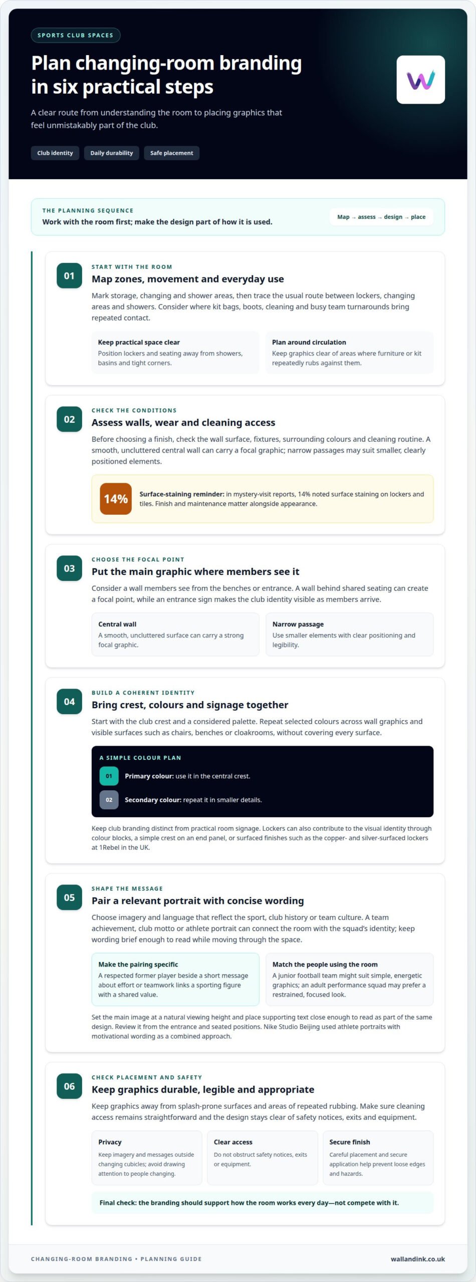
Changing rooms face repeated contact from kit bags, boots, cleaning and busy team turnarounds. Metal lockers can provide resilience in heavily used facilities, while benches need sturdy, hygienic surfaces. Keep lockers and seating away from showers, basins and tight corners where moisture and movement can affect daily use. In mystery-visit reports, 14% noted surface staining on lockers and tiles, showing why finishes and maintenance matter alongside appearance.
How do you choose a supplier for sports club changing-room branding in the UK? Look for a process that considers the wall surface, foot traffic, cleaning routine and graphic placement before shaping the design. The result should suit how the room is used, rather than treating the wall as a separate decorative feature.
For a practical, durable design, map the room before finalising graphics. Separate storage, changing and shower areas to support hygiene and easier maintenance, then consider the usual route between lockers, changing areas and showers. Keep graphics away from splash-prone surfaces and places where kit or furniture repeatedly rubs against them. This helps the design work with the room, not against it.
What privacy and safeguarding considerations apply to changing-room branding? Keep imagery and messages outside changing cubicles, and avoid designs that expose or draw attention to people changing. Where portraits appear in shared areas, choose suitable images and place them so the focus stays on team identity.
How do you design changing-room branding for different age groups and sports? Start with the sport’s colours, symbols and shared values, then tailor the imagery and wording to the team using the space. A junior football team might suit simple, energetic graphics, while an adult performance squad may prefer a more restrained, focused look.
Assess the wall before selecting a finish. A smooth, uncluttered central wall can carry a strong focal graphic, while narrow passages may suit smaller, clearly positioned elements. Account for cleaning access, fixtures and surrounding colours so maintenance stays straightforward and the branding remains legible.
2. Motivational graphics and athlete portraits
A portrait or short message can give a changing room a clear focal point. Begin with a wall members see from the benches or entrance. A team achievement, club motto or athlete image can connect the space with the squad’s identity. Keep wording brief enough to read while moving through the room.
A club could feature a respected former player alongside a short message about effort or teamwork. This pairs a recognisable sporting figure with a shared value, rather than relying on decoration alone. Choose photographs and wording that feel relevant to the people using the space and reflect the sport, club history or team culture.
Plan the composition before installation. Set the main image at a natural viewing height, with supporting text close enough to read as part of the same design. A team slogan beside a portrait makes the message specific; a cluster of unrelated quotes may compete for attention. Review the design from the entrance and seated positions.
For health and safety, keep graphics legible and clear of safety notices, exits and equipment. Secure application and careful placement help prevent loose edges and obstructed access from becoming hazards.
How can changing-room branding improve club identity, motivation and behaviour? A consistent crest, team colours and selected athlete portraits make the club’s identity visible in a shared space. A message such as “work for each other” can reinforce a team value and prompt conversation, while keeping the design focused on the club’s culture.
For clubs with reception or hospitality areas, carrying the same visual language into retail and hospitality graphics can connect the wider venue. Keep changing-room artwork focused on its audience, with clear imagery and messages suited to the sport and squad.
Nike Studio Beijing in China used portraits of famous athletes and motivational wording in its changing-room design. The example shows how imagery and concise language can work together, rather than asking either element to carry the whole message. Clubs can adapt the approach with portraits and wording that reflect their squad’s identity, then check that both are clear from the room’s usual viewing points.
3. What branding options are suitable for a sports club changing room?
Start with the club crest, then choose where it will be easiest to see. A football club can display its crest on a wall, floor or ceiling, or use a sign featuring its name or slogan. A wall behind shared seating creates a focal point, while an entrance sign makes the identity visible as members arrive. Keep club branding distinct from practical room signage.
Club colours can tie together features that might otherwise feel separate. Use them across chairs, benches or cloakrooms, then repeat selected shades in wall graphics. For example, place the primary colour in the central crest and use a secondary colour for smaller details. A consistent palette gives the room a recognisable scheme without covering every surface.
Lockers also offer a way to introduce colour and texture. At 1Rebel in the UK, copper- and silver-surfaced lockers contribute to a striking changing-room design. A local club could instead use colour blocks that echo its kit, or add a simple crest to a locker-bank end panel. These choices make storage part of the overall visual identity.
Match the branding to the club’s character. A community football club might prioritise its crest, familiar colours and a concise slogan. A strength and conditioning club could use a restrained palette and direct typography. Choose a style that suits the sport and the people using the facilities, rather than adopting a theme for impact alone.
Plan the elements as one system: choose a focal point, establish the colour palette, then select supporting signs and finishes. Check that the crest is legible from the entrance and slogans can be read at a glance. Consider how graphics relate to lockers, seating and cloakrooms. A coherent design gives members a clear sense of place without making every surface compete for attention.
L’Usine in Belgium used lacquered glass-fronted lockers, warm LED details and illuminated vanities; its patchwork locker doors featured the club’s colours. Hard Candy Fitness in Italy combined baroque details with an industrial backdrop.
4. Which materials and finishes are best for changing room wall graphics and signage?
Start with the wall, not the artwork. Note whether the surface is painted, tiled, textured or interrupted by fittings. A graphic designed for a smooth wall may not suit a rough or uneven area. Record the position of showers, basins, lockers and seating, then place the design where daily movement and routine cleaning won’t make it difficult to maintain.
Moisture and cleaning affect where graphics belong. Keep a large crest or team message on a dry wall, away from direct splashes and frequent contact with wet kit. In a shower area, prioritise clear practical signs and avoid decorative elements where water exposure would complicate upkeep. The right location depends on the surfaces and how members use the room.
The finish affects how a graphic looks under changing-room lighting. A high-contrast design can make a club name easier to distinguish from its background; a restrained palette can stop signage competing with lockers and fixtures. Before finalising the artwork, review it against the wall colour and adjacent surfaces, using the room’s actual lighting.
BXR London chose changing-room finishes to match the club’s urban warehouse character. The example shows why materials and appearance should support a venue’s identity rather than feel disconnected from it. A community club might set its crest against a simple painted wall, while a contemporary facility could coordinate signage with existing industrial finishes.
Make the selection process practical. Identify the wall surface, assess moisture exposure, map fixtures, then choose a finish that keeps the message visible and maintenance manageable. A wall mural can create a single focal point; smaller signs can provide wayfinding without crowding it. Clear spacing, legible lettering and consistent colour help the elements work together.
Planning a club identity for a busy facility? Plan changing-room wall graphics around the existing surfaces, layout and visual character.
Wall & Ink
Wall & Ink helps clubs turn their changing-room identity into considered wall graphics suited to the space and its use. Its bespoke design process can bring crests, team colours, motivational messages and athlete portraits together in a coherent visual scheme.
For a lasting wall-based finish, Direct-to-Wall Printing applies artwork directly to the wall, while Commercial Wall Murals can create a larger visual feature. Wall & Ink provides digital visualisations and professional on-site installation, helping clubs plan how graphics will sit alongside existing fixtures and finishes.
When you’re ready to move from branding ideas to a designed and installed wall feature, share your changing room’s intended look and practical requirements with Wall & Ink to discuss your project.
Turn your club’s identity into a lasting space
A changing room can express what your club stands for every time the team gathers. Treat sports club changing-room branding as part of the facility’s identity, not a decorative afterthought. Decide what members should recognise and feel in the space, then shape the design around that intention.
Bring together the ideas that matter to your club, from its visual identity to the message it wants athletes to carry onto the pitch or court. Wall & Ink can translate those decisions into a tailored wall design, planned for the room and its existing surfaces.
Start the conversation with your priorities, preferred imagery and the character of the changing room. Contact Wall & Ink to discuss your project and take the next step towards a space that feels distinctly yours.
Wall & Ink for Sports Club Changing Room Branding
Wall & Ink provides Direct-to-Wall Printing and Commercial Wall Murals, both suited to branding a sports club changing room.
Talk to Wall & Ink when you’re ready to explore how wall graphics could shape your changing-room space.
Frequently Asked Questions
How durable and easy to clean are different changing room branding materials?
Durability depends on the material, surface and exposure to moisture or contact. Metal lockers offer resilience, while wall graphics need a finish suited to their location and cleaning routine. Wall & Ink’s direct-to-wall prints resist light surface scratches and moisture, but are not waterproof. Use them on a suitable indoor wall, for example, rather than treating them as a waterproof finish for a shower area.